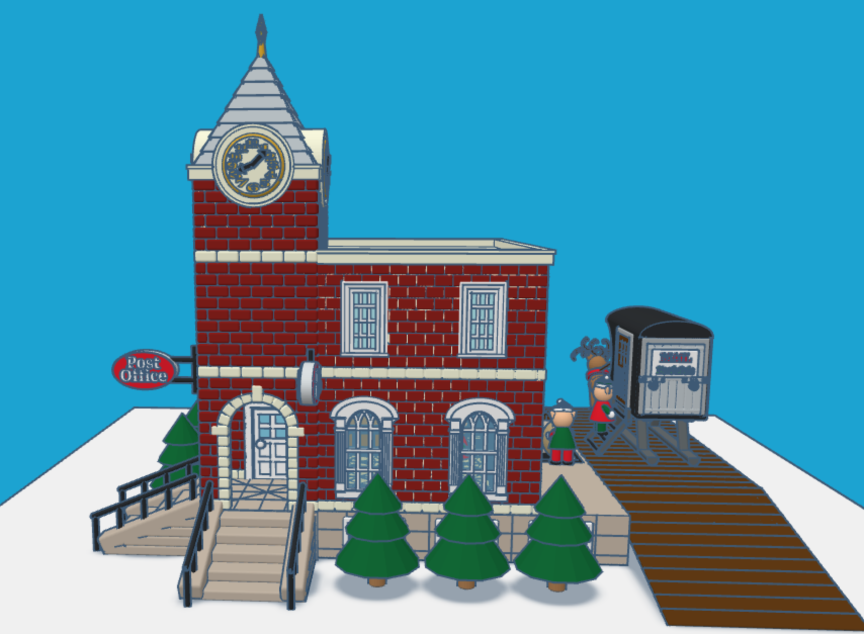
It is that time of the year again. Children all over the world are putting pencil, pen, or crayon to paper and writing a letter to Santa. This year I envisioned what Santa’s North Pole Post Office would look like. Looking at pictures of old-fashioned post offices I decided on the design and used Tinkercad to create a Post Office.
You can get a 3D view of the North Pole Post Office at this link: North Pole Post Office.
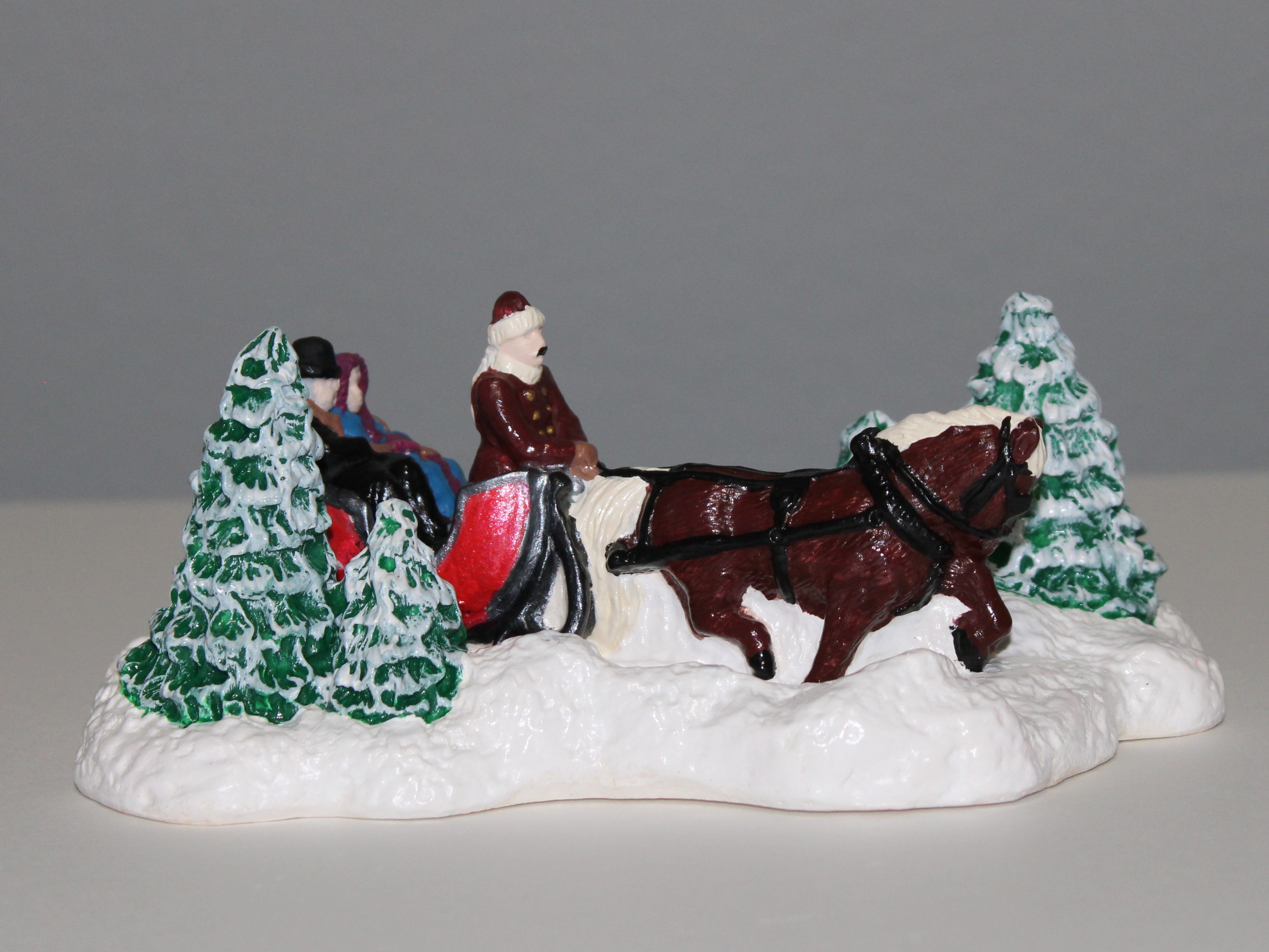
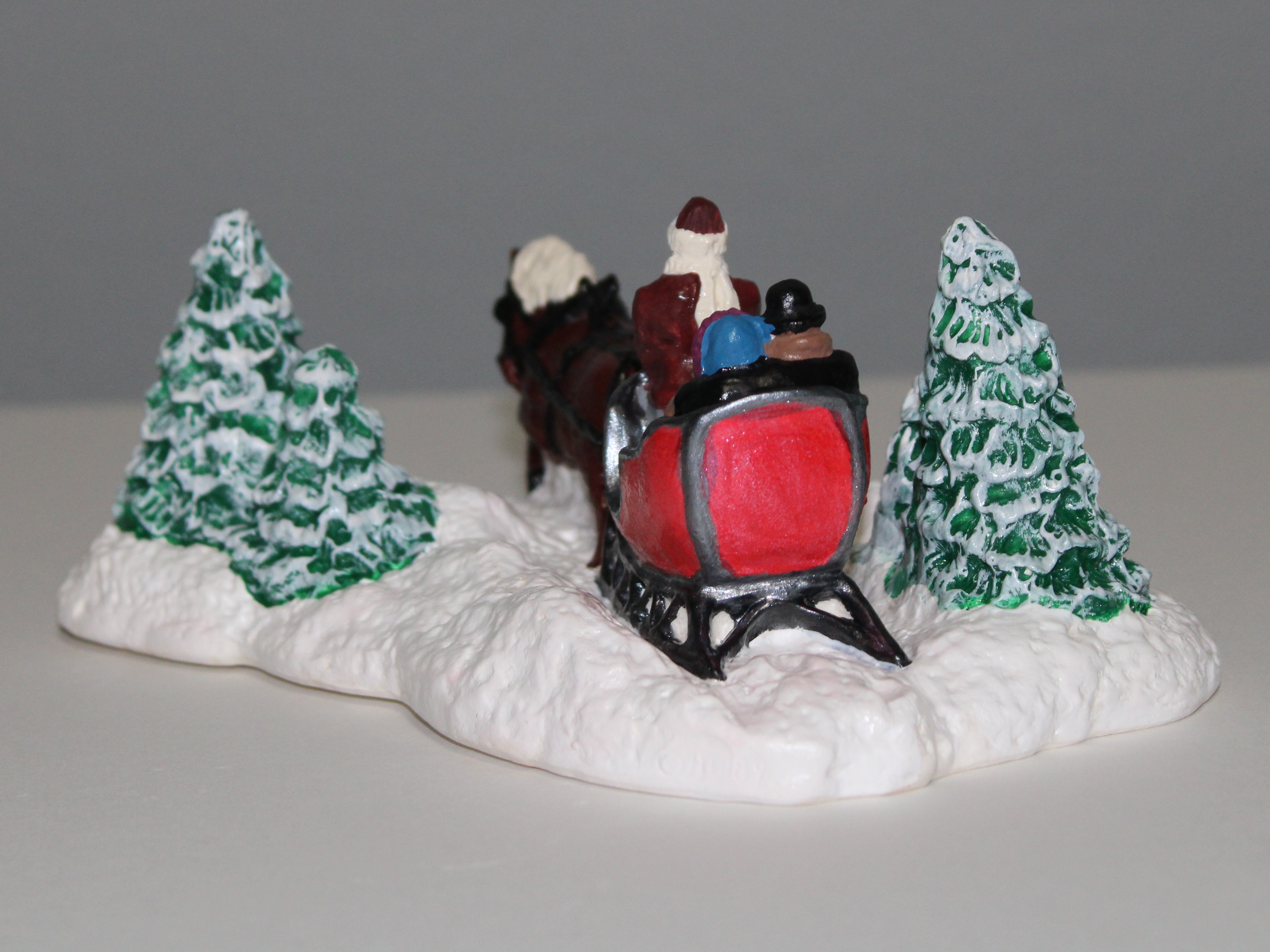
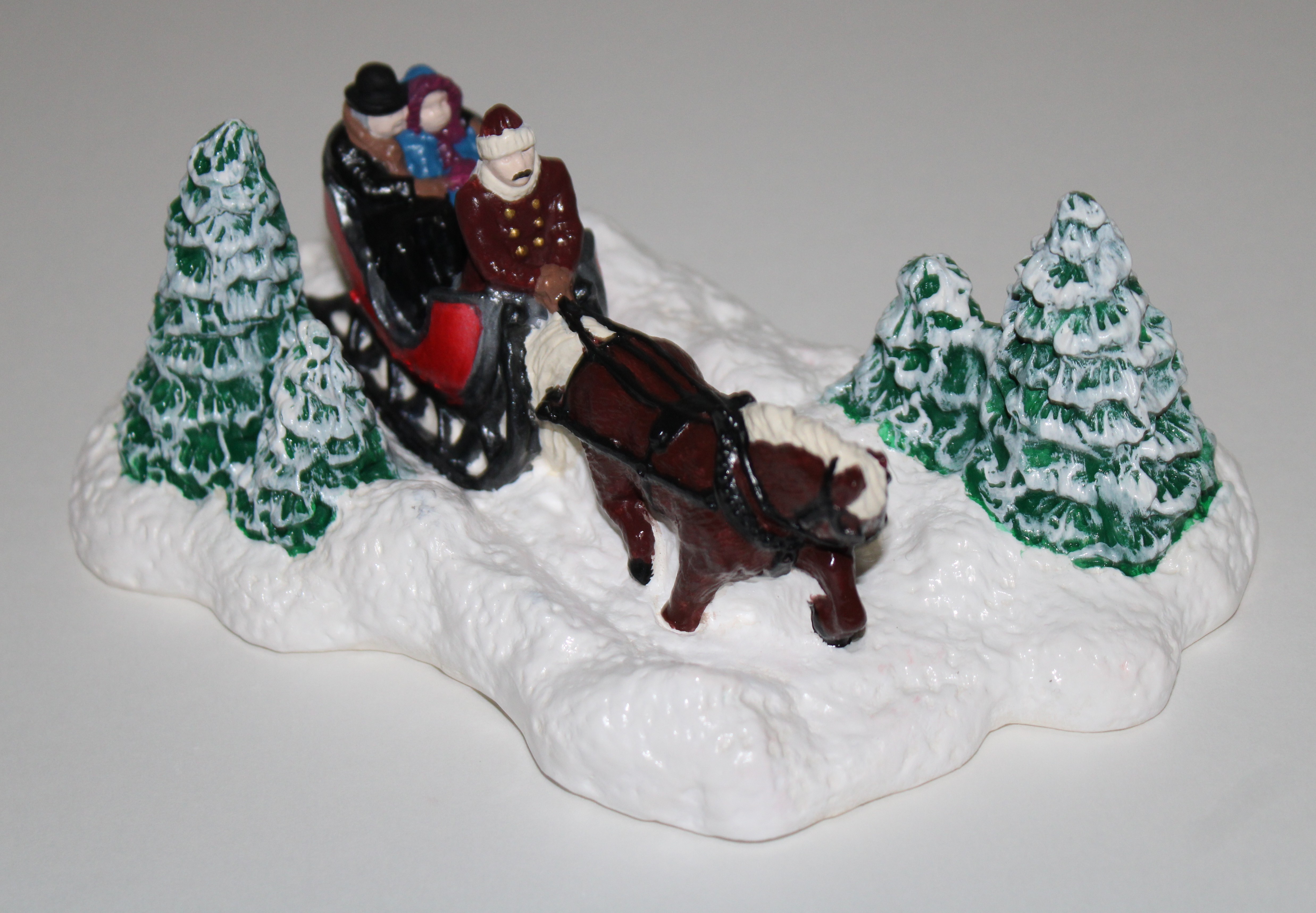
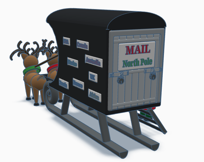
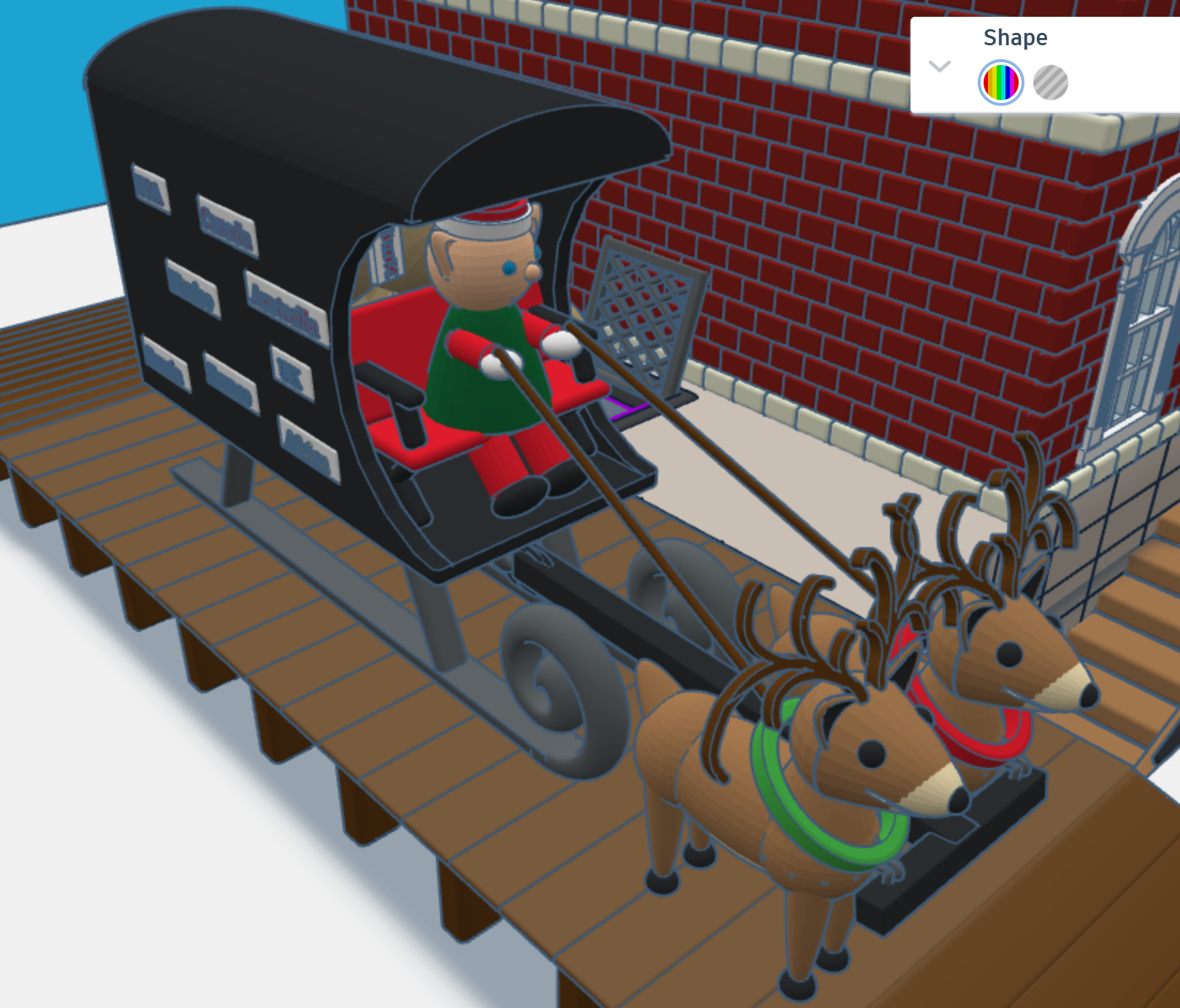
First, I needed a mail truck to deliver mail to the North Pole. A truck with wheels would have trouble delivering mail in the snow. I needed some reindeer and a converted sled to deliver the mail. One the side of the mail carrier, you will see signs from different countries. If you create a sign for your country, just make your sign design public/copyable and tag #sarahcath. I will put the sign on the mail carrier and give you credit. You can get a 3D view of the mail carrier at this link: North Pole Mail Carrier
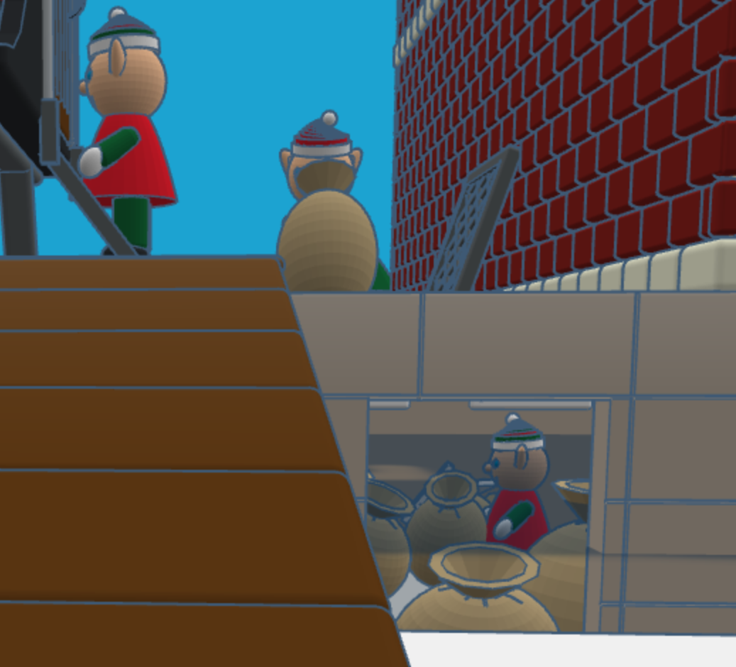
For the design of the post office I decided on a corner building, with two entrances/exits and a clock tower. Plus, I wanted the post office to have a basement, where the elves would place the sacks of mail.
After the mail is delivered, a sack is sent upstairs for sorting by country. Santa typically delivers mail by country. The first floor also allows the elves to ship letters and packages.
After the mail is sorted, it is sent to the second floor to be opened and read by Santa. The second floor also has mailboxes for the elves. Yes, elves do get mail.
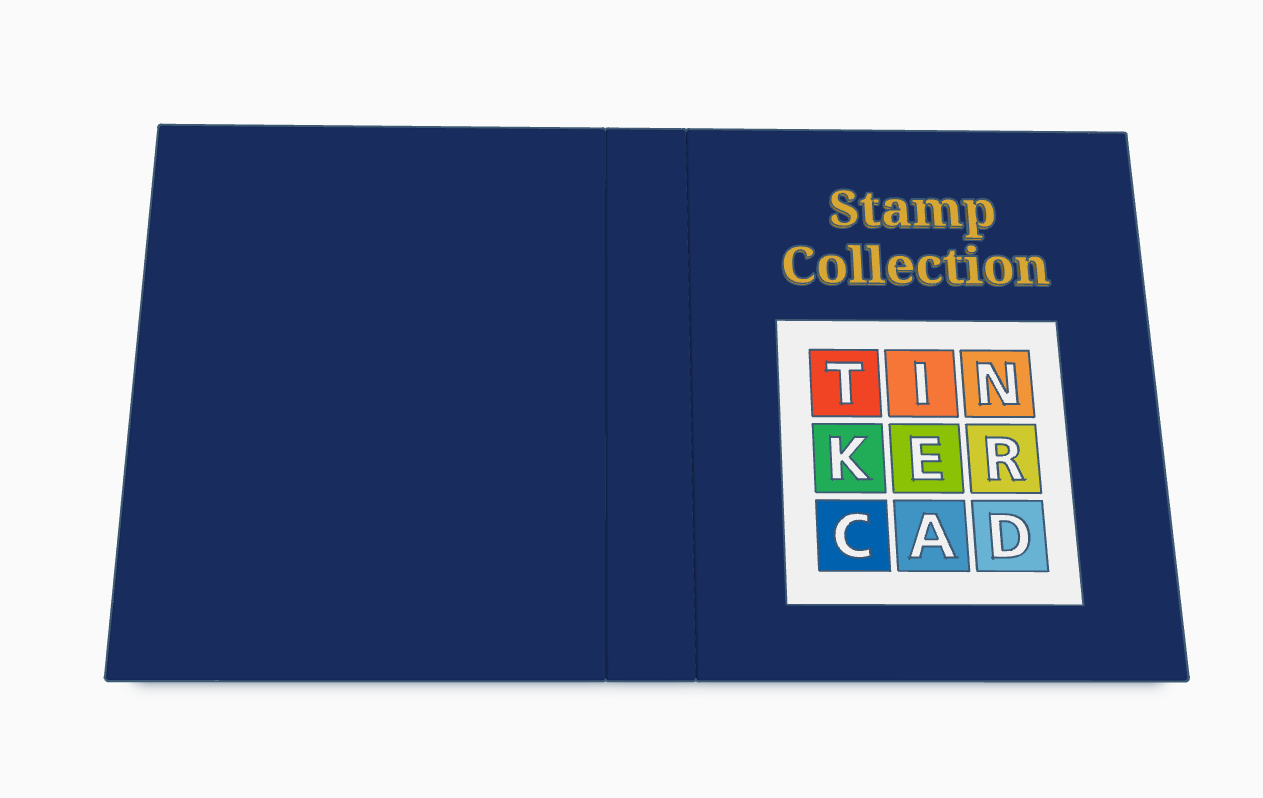
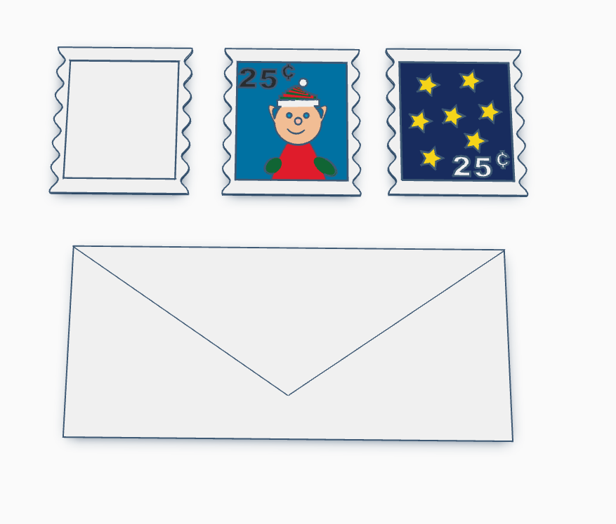
Santa’s Elves are collecting stamps. If you create a stamp, using Tinkercad, and I will paste it into the Stamp Collecting Book and give you credit for your stamp. You can either create the stamp from scratch or use my stamp template. Just make the stamp design copyable/public and tag #sarahcath when you are done. The scribble shape in Tinkercad maybe great for making a stamp.
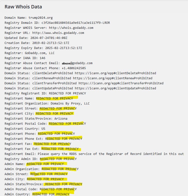
Why do I believe this? By, looking at the domain registration on https://www.whois.com/whois. Most reputable sites would not have all of its data “REDATED FOR PRIVACY”.
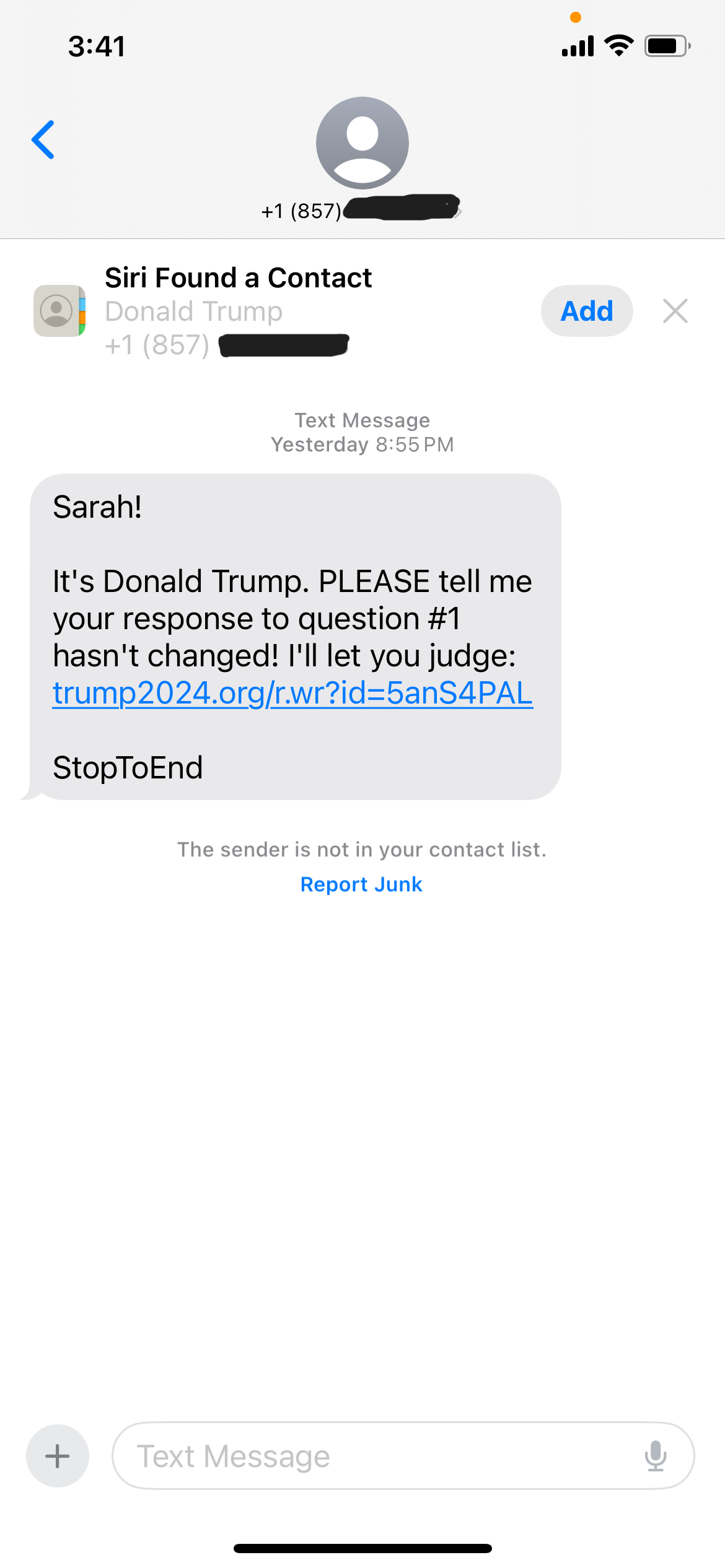
They made the text message look very legit, by referencing my name, including a Contact card for a “Donald Trump”. From media reports he lives in Florida, after moving there from New York. Why would he have a cellphone for a Massachusetts area code?
Lastly, the text message makes little sense. “PLEASE” and “I’ll let you judge.”? Let me judge what? I would have to answer a survey for my answer to a question to change. Surveys, just want to gather more data about you to sell to other entities.
If I wanted a more historic visit to Austin, I should have selected another museum to visit, but that would require a lot more walking or trying to find a place to park. The Museum of Weird was only a short walk, and it is weird. Upstairs features a wax museum. The people the operate the museum are awesome. There is a gift shop where you can purchase your own weird merchandise.
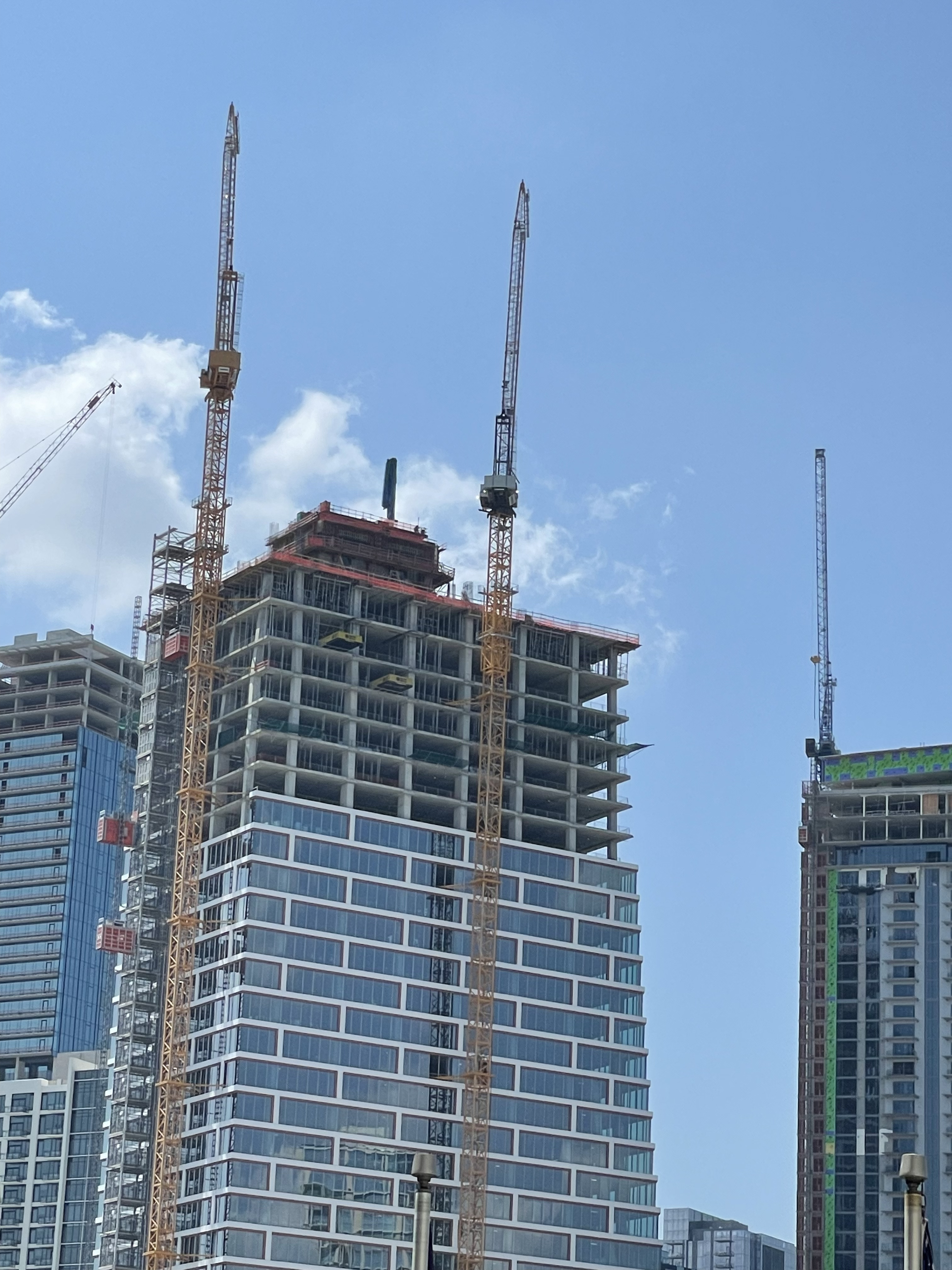
When driving into Austin, TX, you see it’s downtown skyline and you notice all the cranes. There is a crane on top of almost every single building in downtown Austin. Except for the State Capitol building, it has scaffolding around it.
Every day I was in Austin, it had beautiful days with blue skies and 100+ temperatures.
The first day I was there, I walked over 8 miles exploring the downtown area. The State Capitol Building was easy to find, it was at the end of Congress Blvd.
I was not permitted to tour the Governor’s Mansion grounds. I was only allowed to take a picture from the other side of the iron bars.
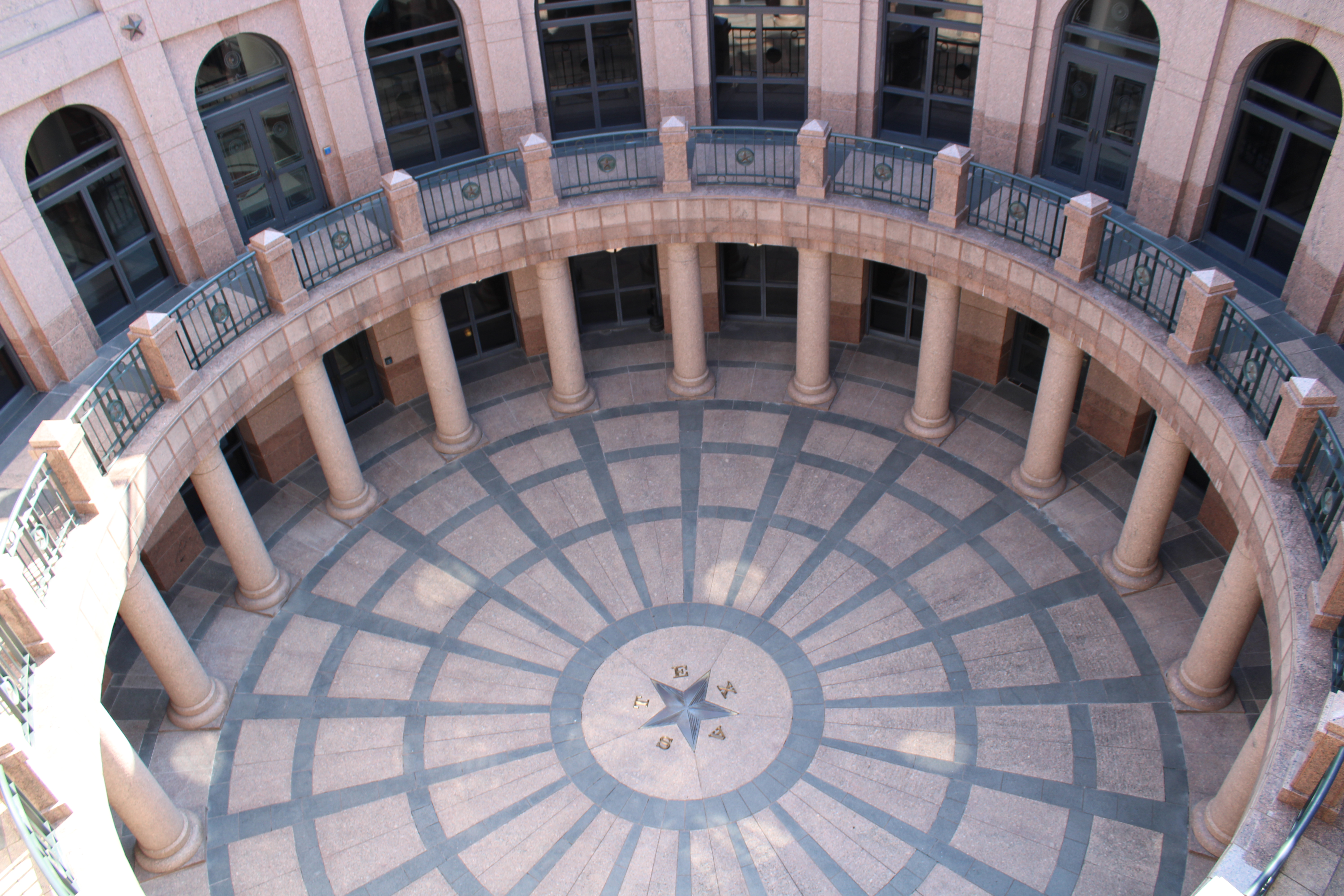
This was the most interesting building I found in Austin was the Open-Air Rotunda. It is located behind the State Capitol Building. It was below grade and had a railing up top for viewing.
Here are a few more images around downtown Austin.
Recently, Sharpie, you know the company that is famous for making permanent markers, released acrylic markers they claimed would “Boldly Mark on Most Surfaces.” I thought it was very interesting and decided to give the Sharpie Creative Color Markers a workout. I purchased both sets, the brush set and bullet set.
My first attempts were on black and white paper. The colors were brilliant and look good on both colors of paper and did not bleed through. The markers would probably look good on any color of paper, because the provide good coverage.
I did not try it on glass. Being water based acrylic markers, they would wash off of glass.
My second, third, and fourth attempts were on wood.
Puzzle One: This design used the both the bullet and brush markers. I was able to obtain blending effects by either painting areas white on the background or blending two colors before they completely dried.
Notice how well the black markers went over the other colors. I did not have to go over the black multiple times to get the effect. The white stars were placed by gentle touching the surface after it dried.
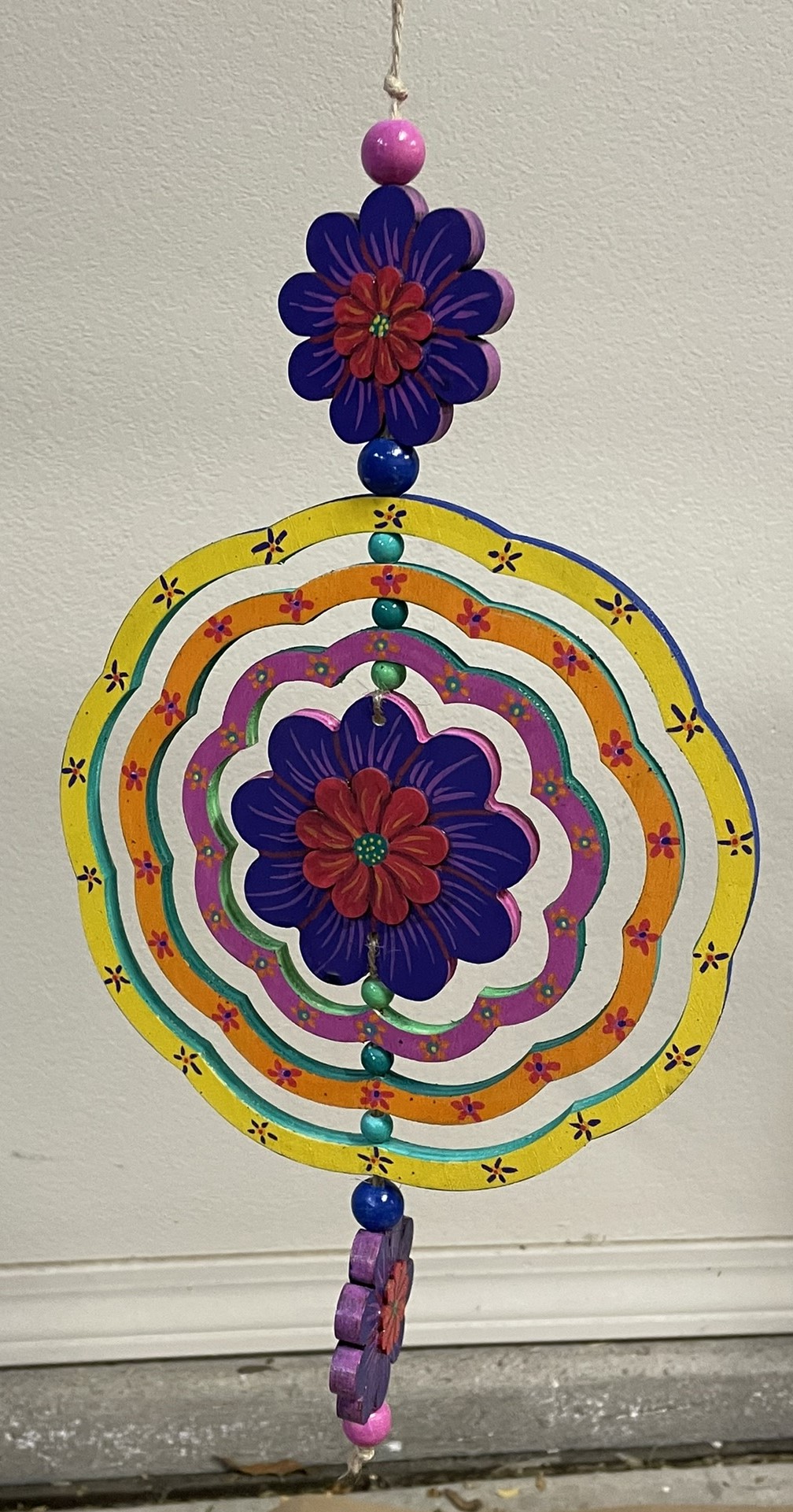
Wind Spinner: Another project using only the Sharpies Creative Color Markers. On this project, after the paint had dried, I noticed that purple color for the brush marker was slightly lighter than the bullet marker. I was able to go over the bullet marker purple with the brush marker purple to get a uniform color.
Every yellow paint I have ever encountered has done a very poor job of covering other colors. The Creative Color Marker yellow also did a poor job of covering other colors. I have an easy solution; I just cover it with white first then go over it in yellow.
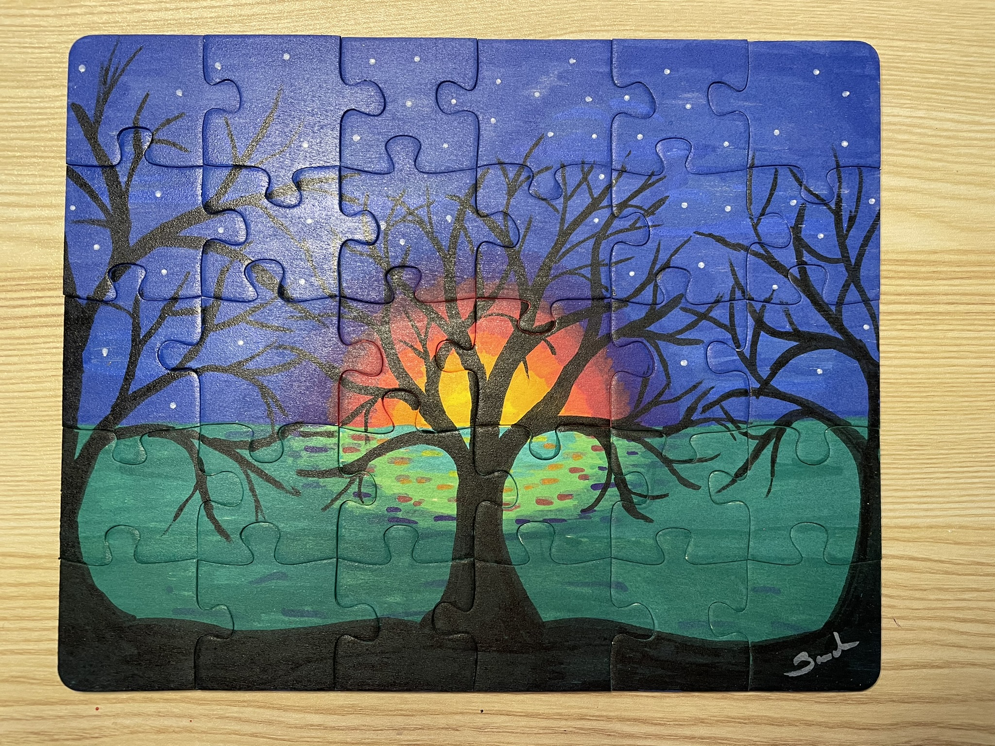
Tree Puzzle: For the base of the tree puzzle, with the exception of the tree, I did not use the Creative Color Markers. I used acrylic paint. The surface was large, and I did not like the idea of having the paint the entire surface with the markers. The tree and flowers were made with the markers.
The background and the tree on the puzzle were all done with the Creative Color Markers. The blending of multiple colors provided the tree with a brown look.
PuzzleBase
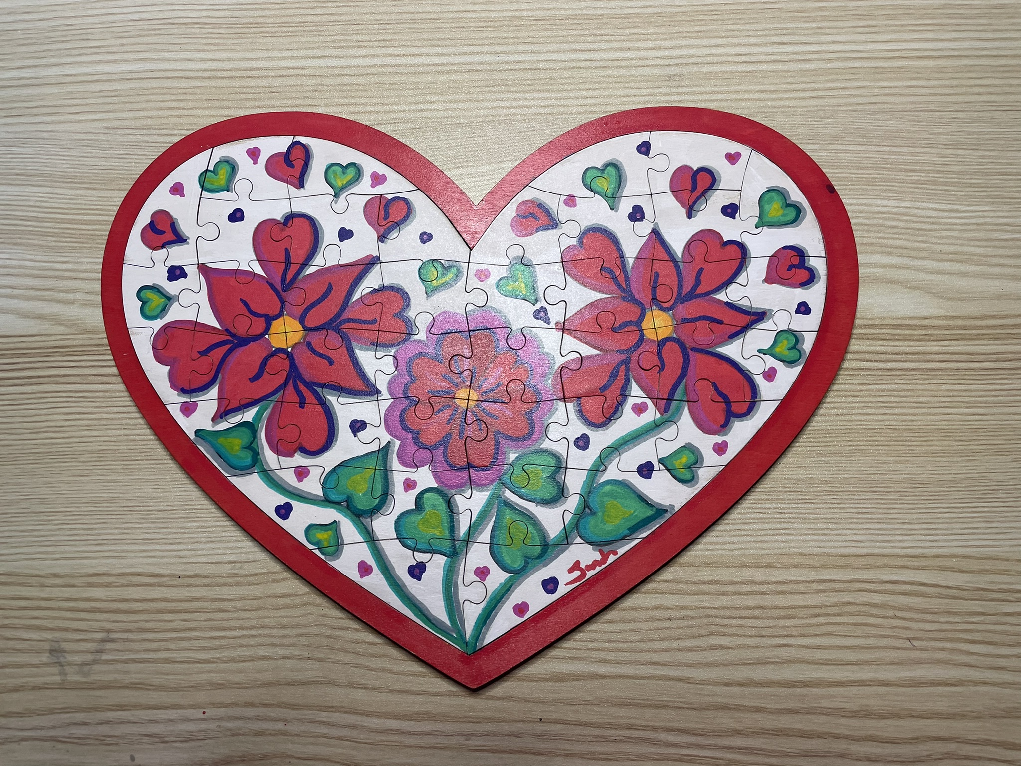
Heart Puzzle: Can you see where I messed up? Probably not because the markers were able to hide my mistakes well. The first design I placed on the heart puzzle I did not like. So, I covered the entire puzzle with Gesso and started a new design. The white marker and the Gesso were almost the same shade. I used the white marker to cover up small mistakes on the white background.
The red and pink marker when placed next to each made it difficult to tell where one color ended, and the other color started. Once touches of purple and black was placed around them, they pop off the canvas.
The edge of the base and the back of the base was covered using red acrylic paint.
PuzzleBase
All the projects were varnished using the Polyacrylic. Some were sprayed and other were brushed. My only desires concerning these markers are: I would like more colors; and I would like to some fine point markers.
I do not see using the markers every day, but they will definitely fit in with some of my projects.
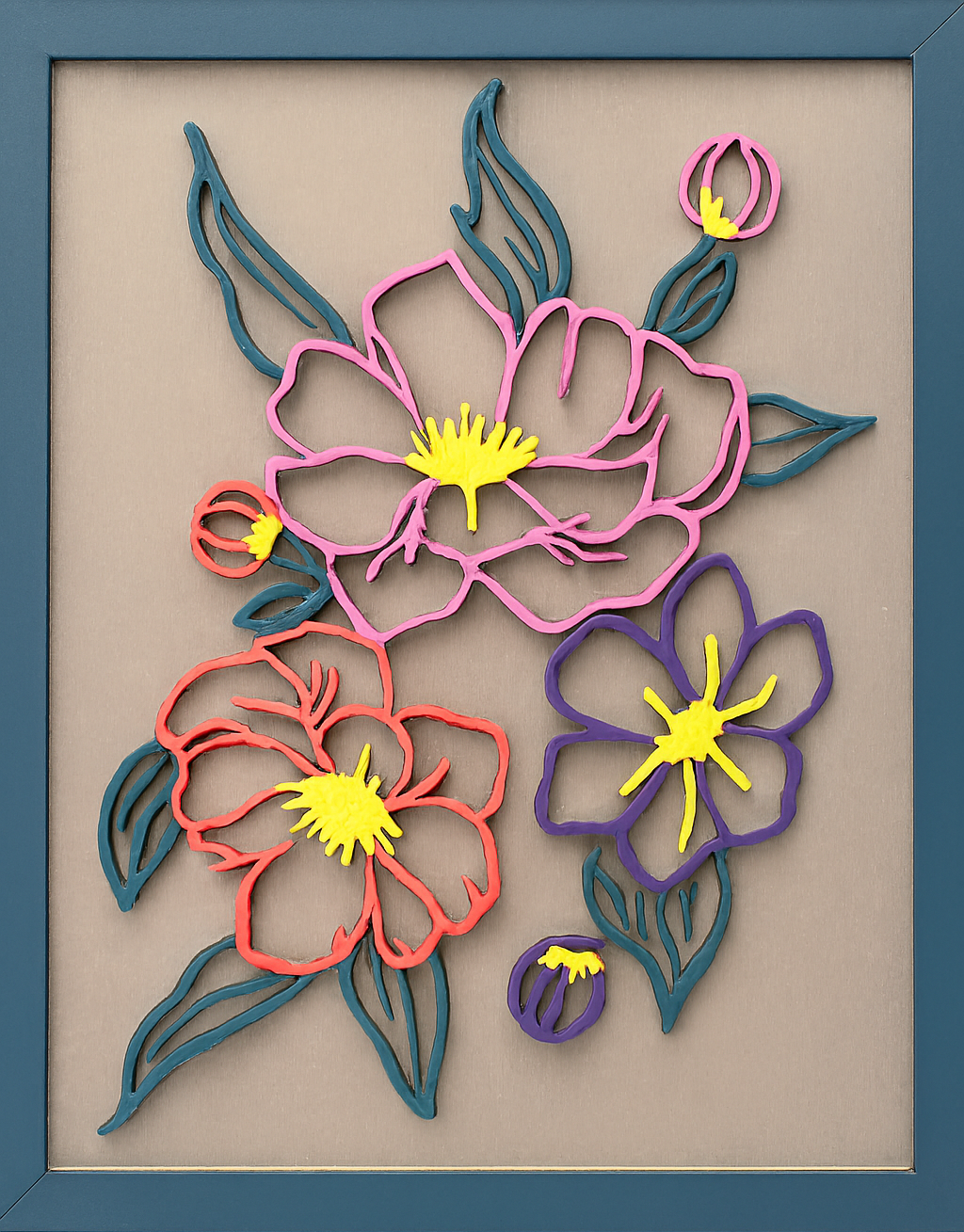
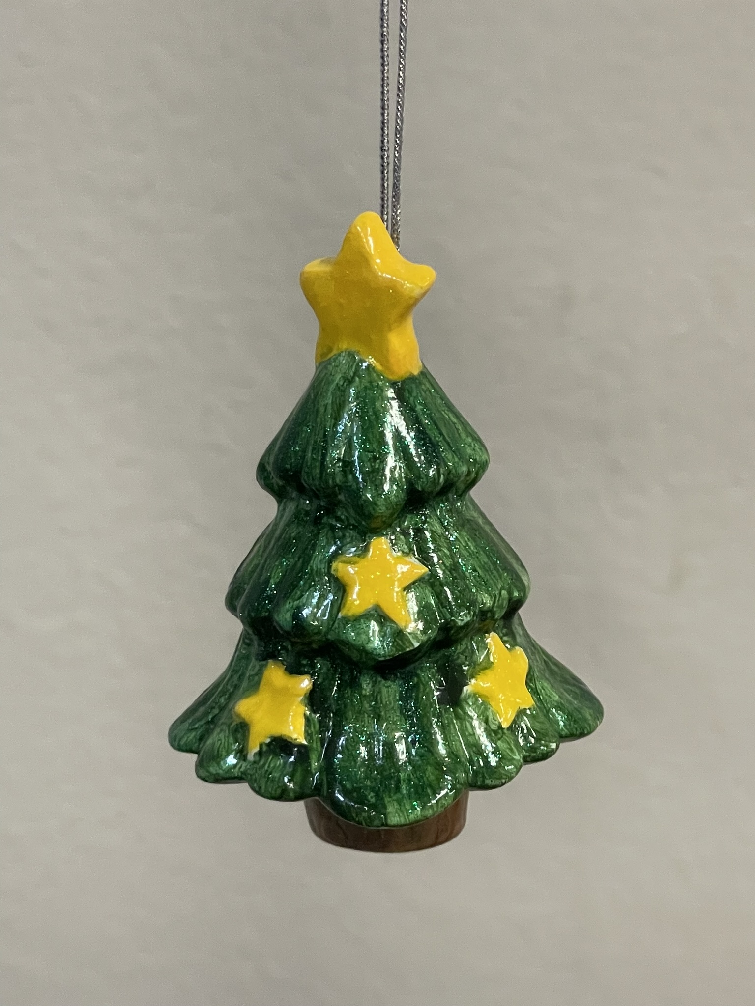
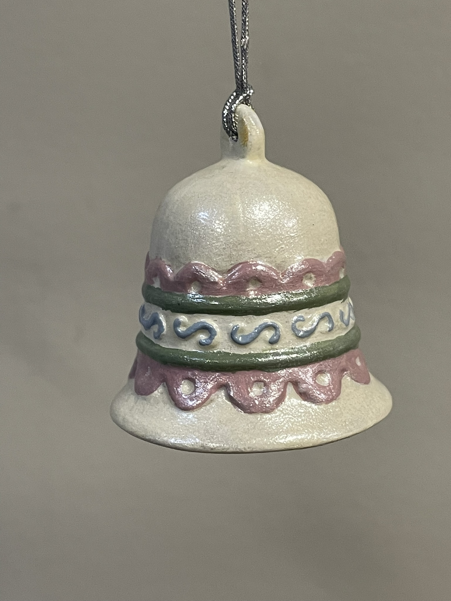
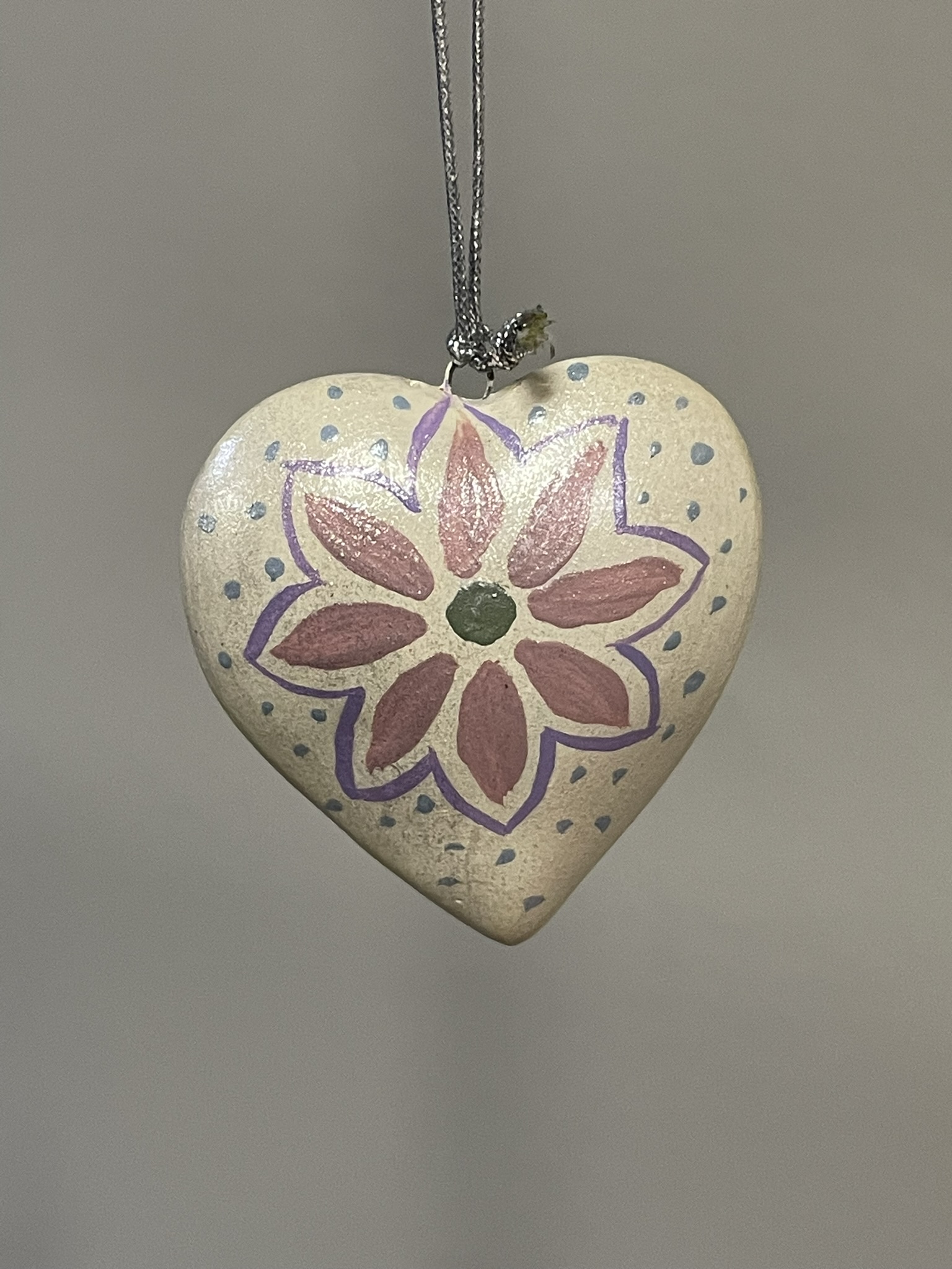
I painted these ornaments in 2023 around Christmas. However, they have been hanging for months, and months, and months waiting to be varnished. The ornaments got a coat of varnish when I varnished every other project I was working on.
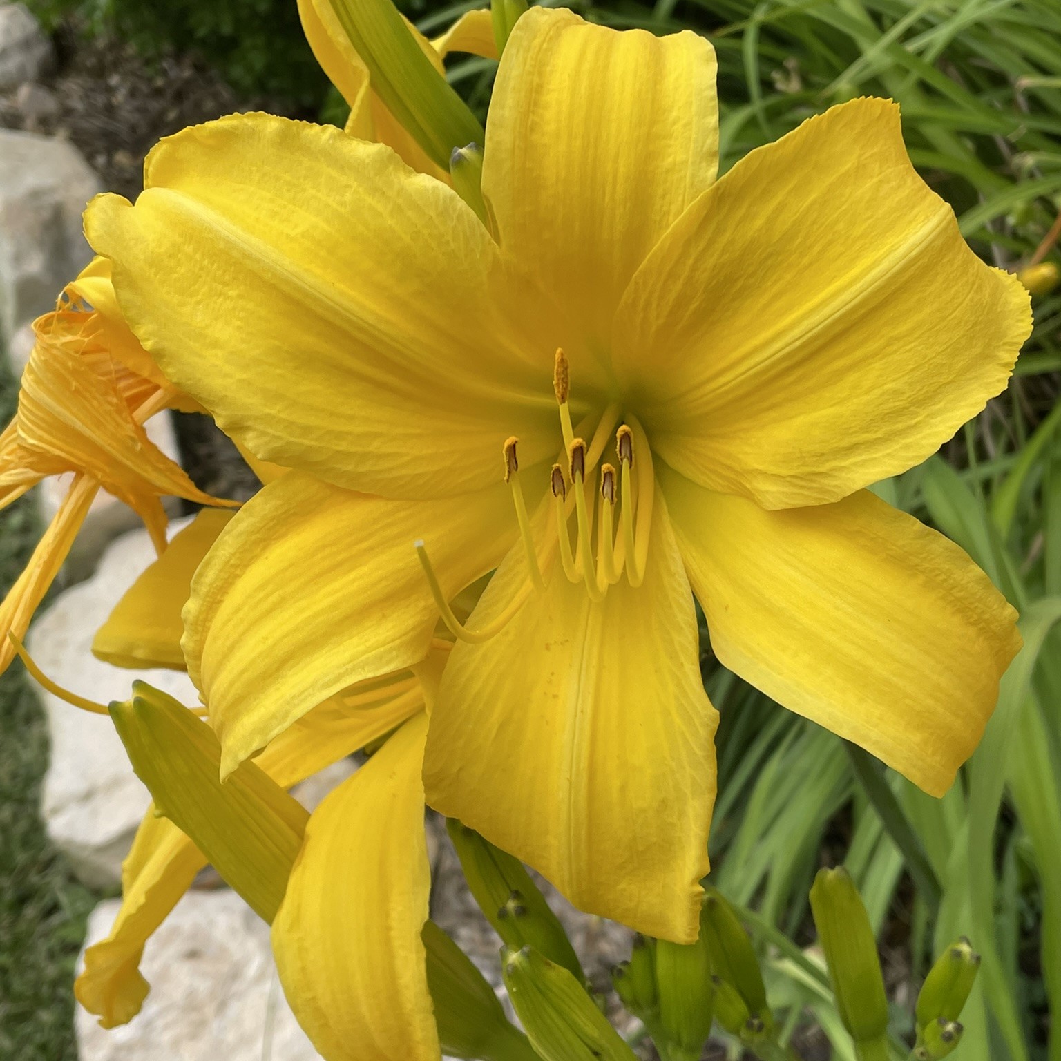
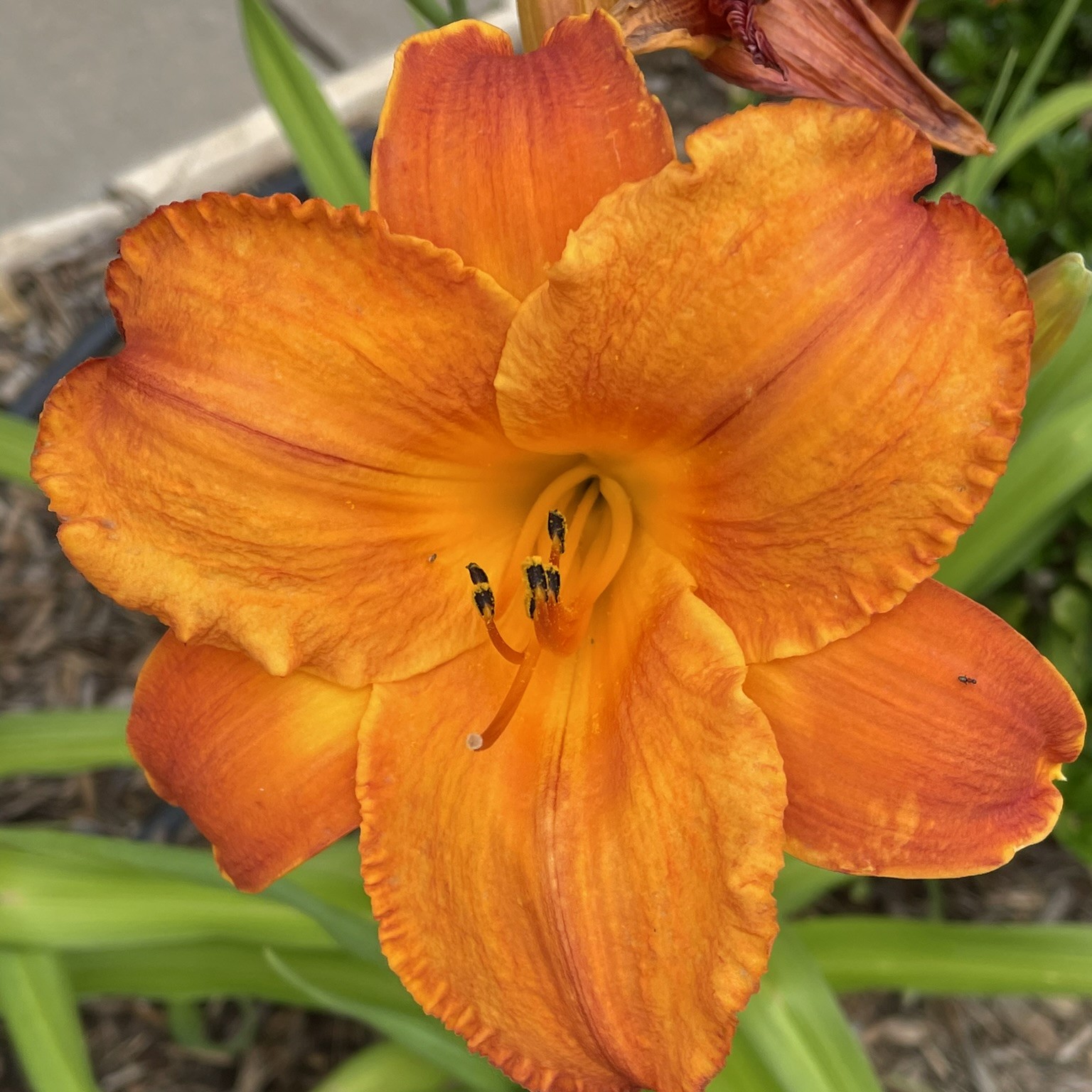
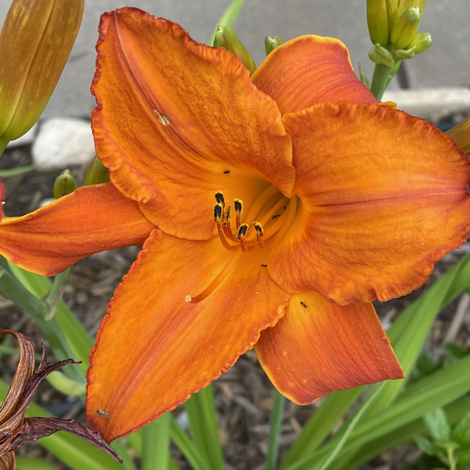
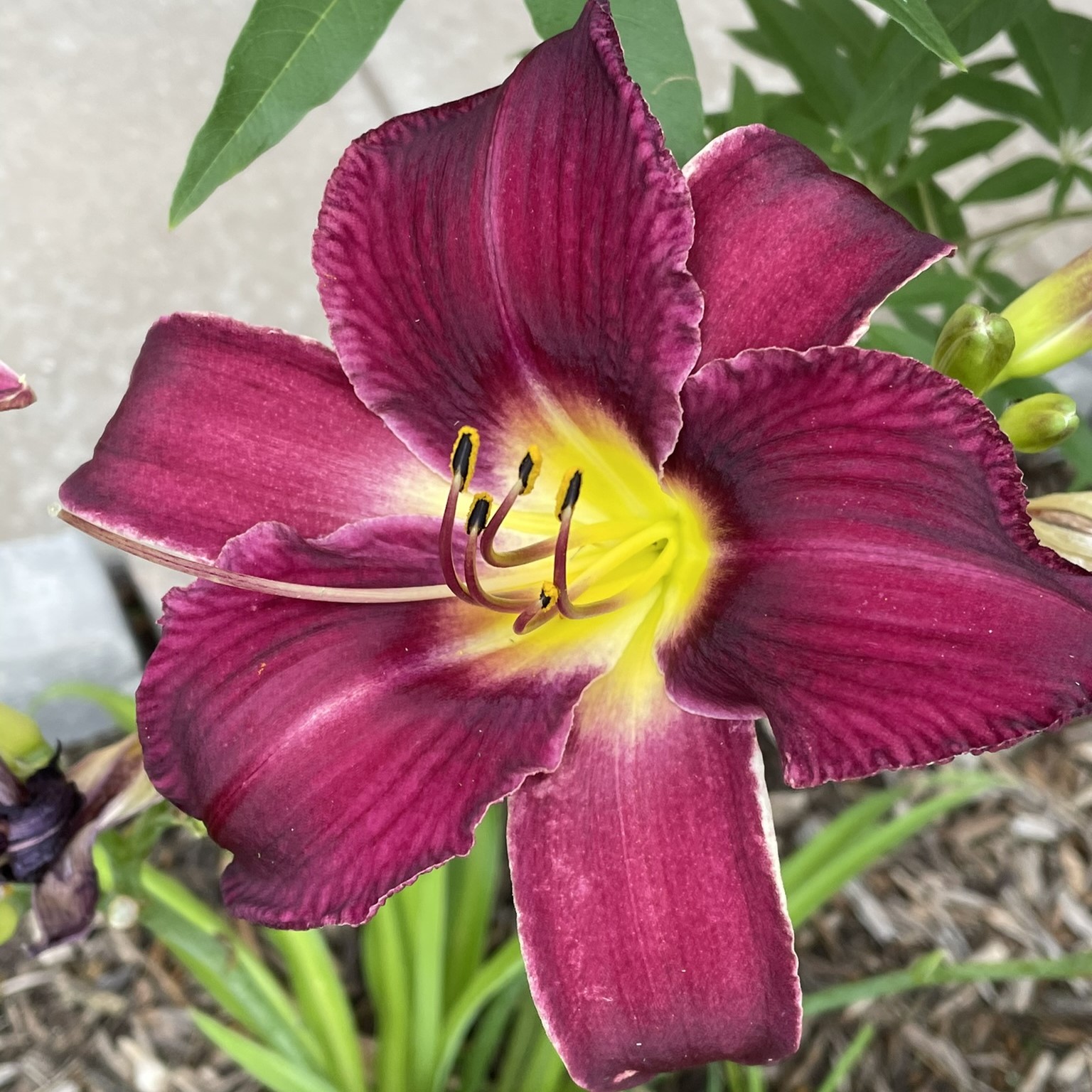
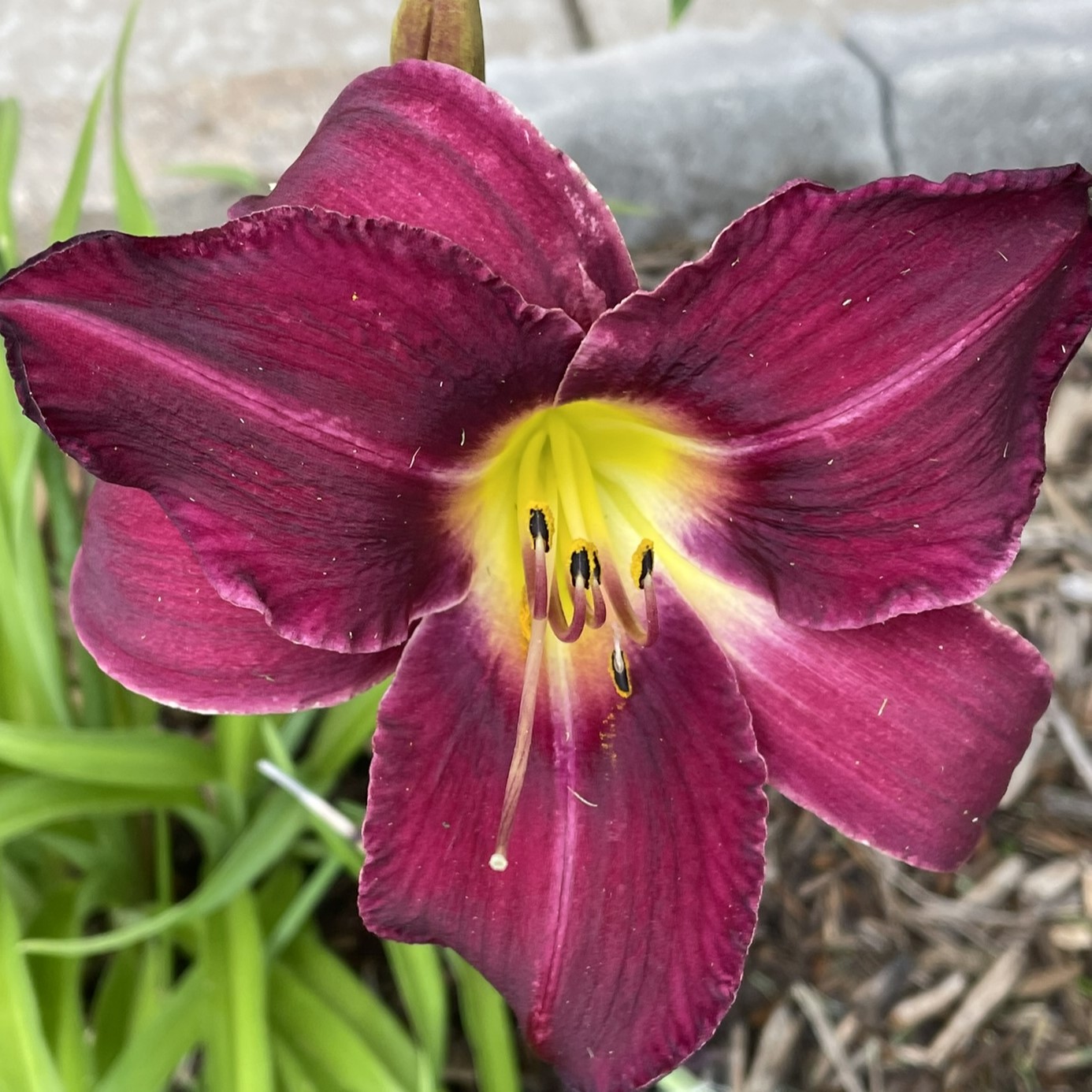
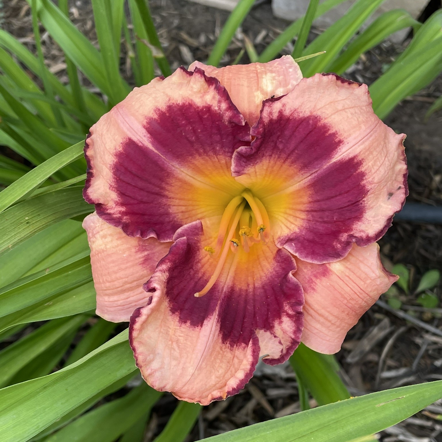
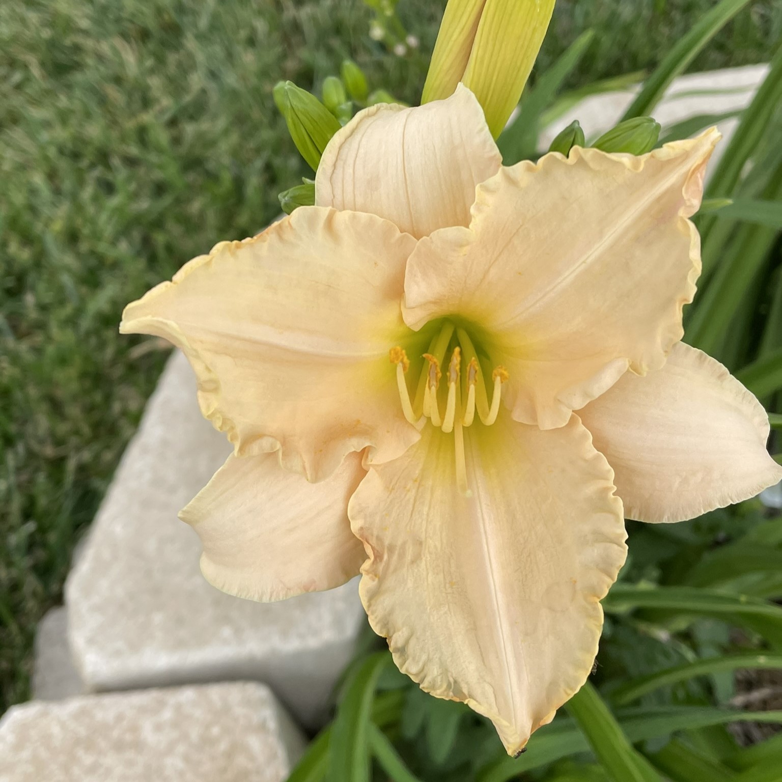
Last year, I planned some daylilies in my yard. Why daylilies? Because they are very low maintenance, and they produce beautiful flowers. I purchased them from Oakley Daylilies because their website allowed me to purchase the correct ones for my region. Last year, they were beautiful. This year, they are gorgeous.
Last year, I also planted a one-gallon Crape Mrytle, and it was a wimp. It hasn’t grown much in a year, but the blooms this year are fantastic. I have a lot of fond memories of climbing the crape mrytle in my backyard, including falling out of the tree. Once I caught my breath, after falling out of the tree, I gave it a dirty look, and climbed in again.
Yes, Roses are beautiful. But, I am developing an extreme dislike for rose bushes, especially the ones in my yard. There is nothing you can do to stop the thrones from sticking you. It doesn’t matter what gloves you have on, or how careful you are. If you attempt to trim them, they will attack.
If you would like to know the name of them flowers, check out Up Close to Flower blog.