Sharpies Creative Markers Review

Recently, Sharpie, you know the company that is famous for making permanent markers, released acrylic markers they claimed would “Boldly Mark on Most Surfaces.” I thought it was very interesting and decided to give the Sharpie Creative Color Markers a workout. I purchased both sets, the brush set and bullet set.

My first attempts were on black and white paper. The colors were brilliant and look good on both colors of paper and did not bleed through. The markers would probably look good on any color of paper, because the provide good coverage.

I did not try it on glass. Being water based acrylic markers, they would wash off of glass.

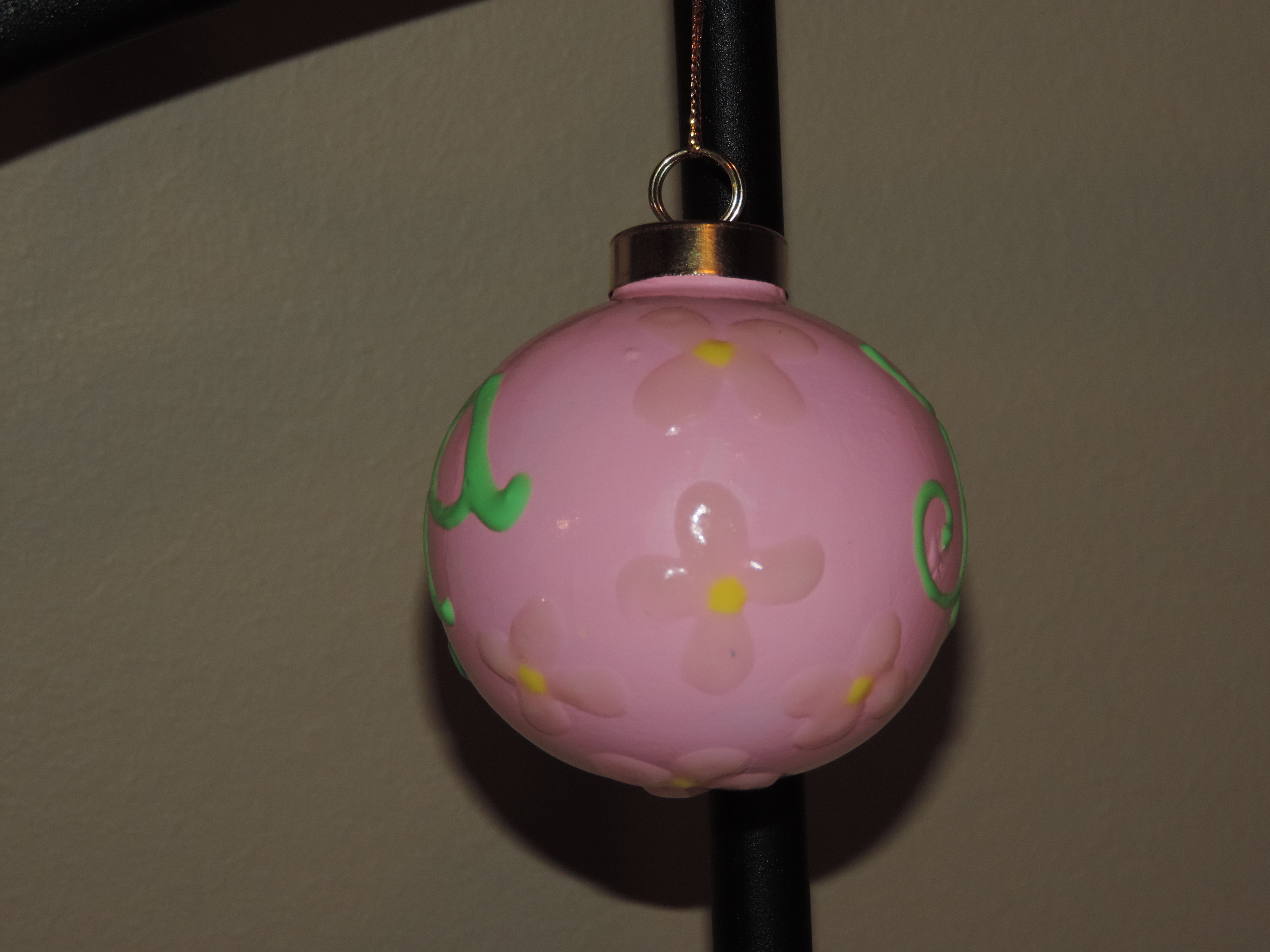
My second, third, and fourth attempts were on wood.

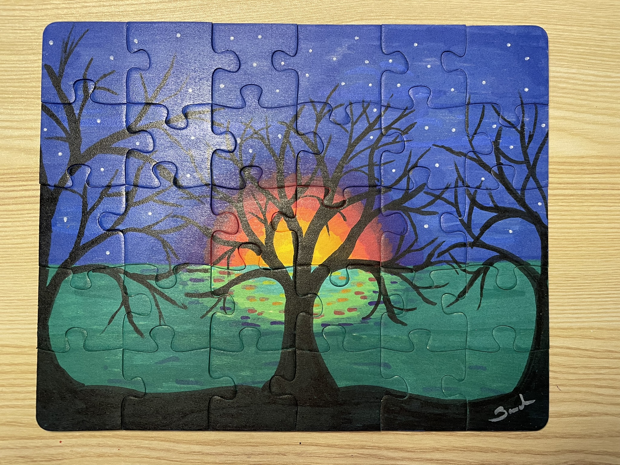
Puzzle One: This design used the both the bullet and brush markers. I was able to obtain blending effects by either painting areas white on the background or blending two colors before they completely dried.

Notice how well the black markers went over the other colors. I did not have to go over the black multiple times to get the effect. The white stars were placed by gentle touching the surface after it dried.

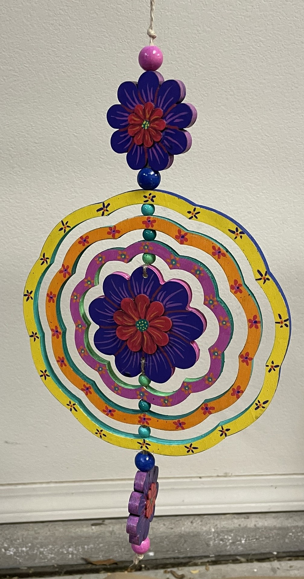
Wind Spinner: Another project using only the Sharpies Creative Color Markers. On this project, after the paint had dried, I noticed that purple color for the brush marker was slightly lighter than the bullet marker. I was able to go over the bullet marker purple with the brush marker purple to get a uniform color.

Every yellow paint I have ever encountered has done a very poor job of covering other colors. The Creative Color Marker yellow also did a poor job of covering other colors. I have an easy solution; I just cover it with white first then go over it in yellow.

Tree Puzzle: For the base of the tree puzzle, with the exception of the tree, I did not use the Creative Color Markers. I used acrylic paint. The surface was large, and I did not like the idea of having the paint the entire surface with the markers. The tree and flowers were made with the markers.

The background and the tree on the puzzle were all done with the Creative Color Markers. The blending of multiple colors provided the tree with a brown look.

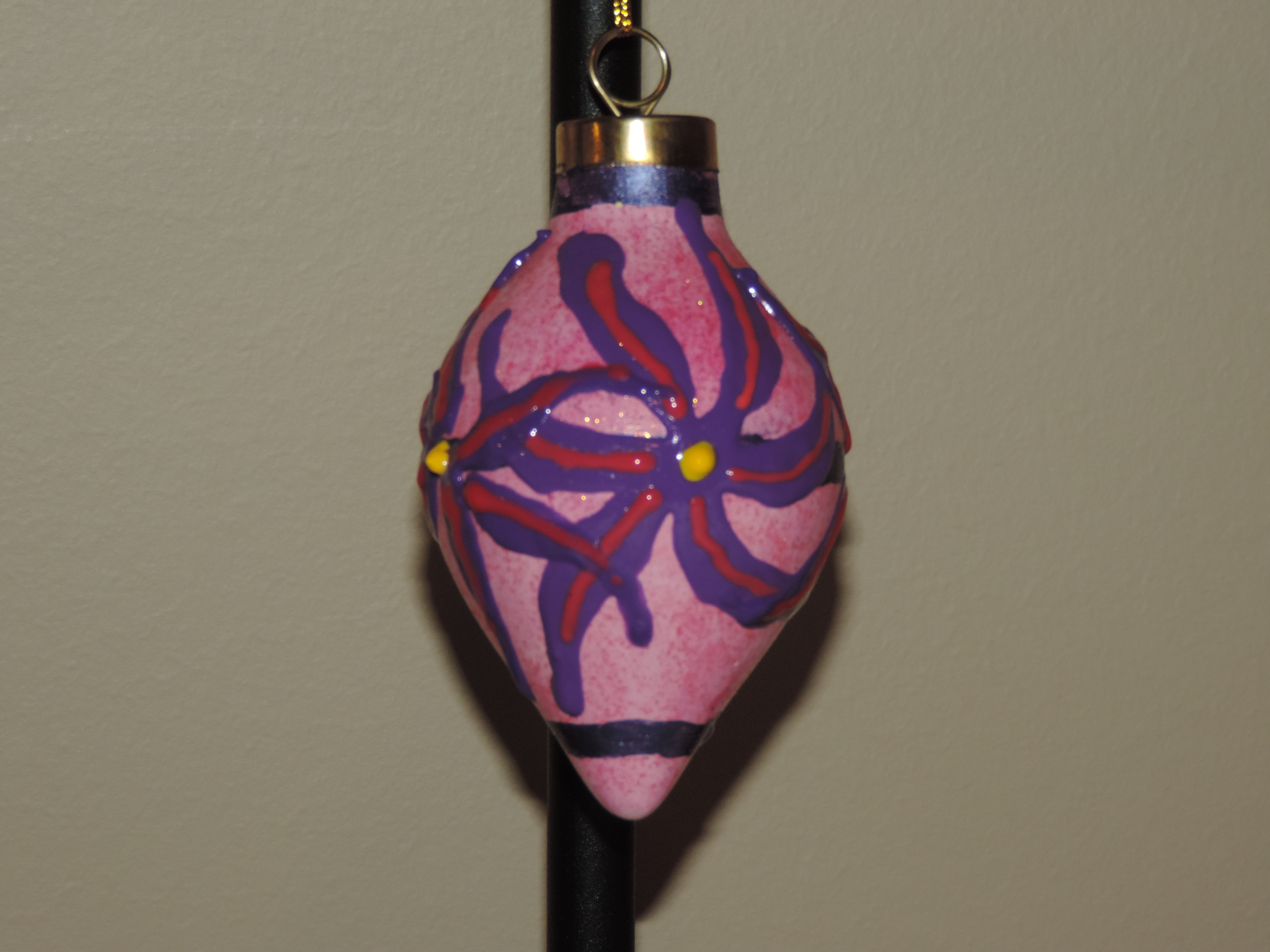
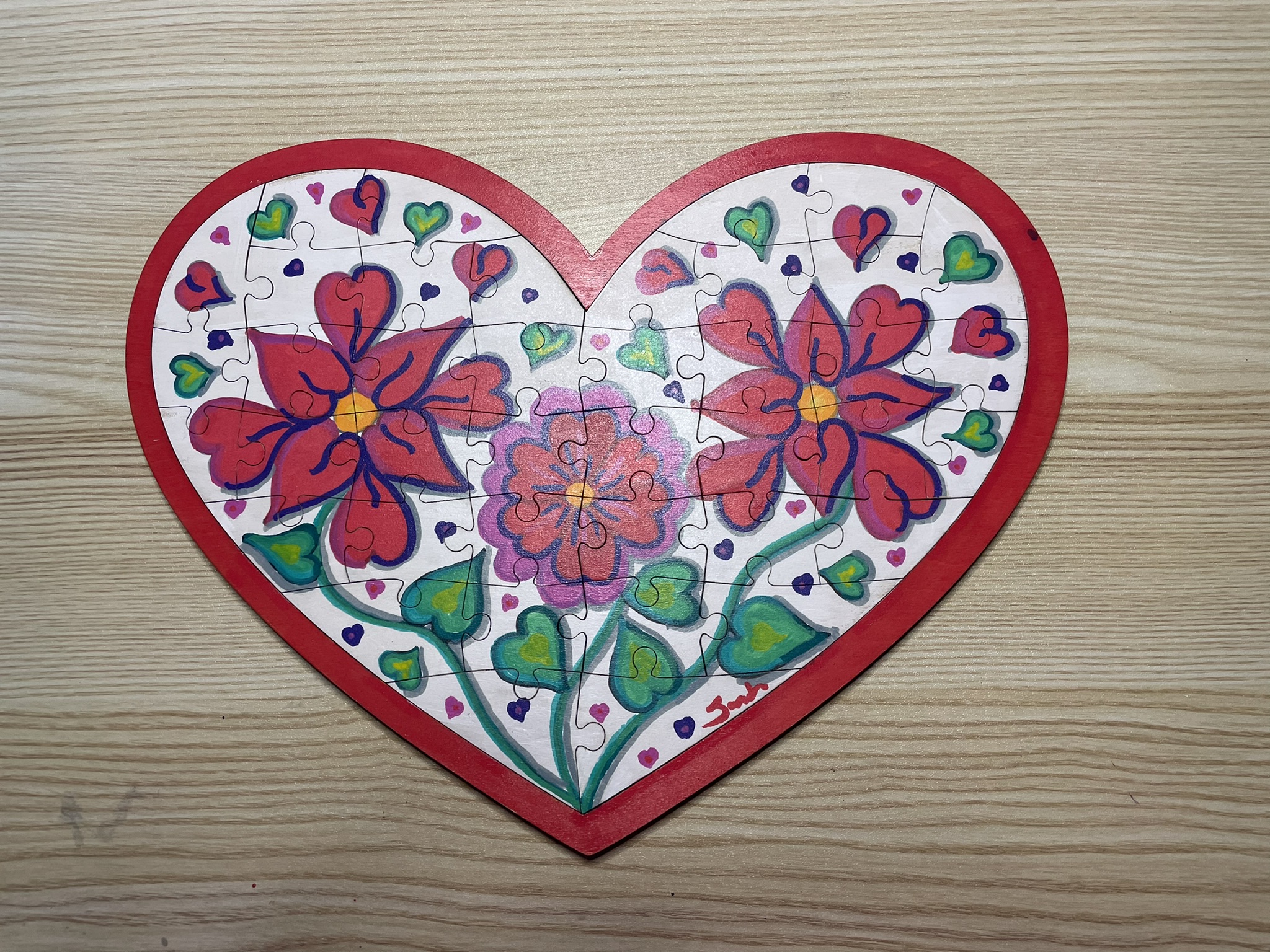
Heart Puzzle: Can you see where I messed up? Probably not because the markers were able to hide my mistakes well. The first design I placed on the heart puzzle I did not like. So, I covered the entire puzzle with Gesso and started a new design. The white marker and the Gesso were almost the same shade. I used the white marker to cover up small mistakes on the white background.

The red and pink marker when placed next to each made it difficult to tell where one color ended, and the other color started. Once touches of purple and black was placed around them, they pop off the canvas.

The edge of the base and the back of the base was covered using red acrylic paint.

All the projects were varnished using the Polyacrylic. Some were sprayed and other were brushed. My only desires concerning these markers are: I would like more colors; and I would like to some fine point markers.

I do not see using the markers every day, but they will definitely fit in with some of my projects.

Hand Painted Nativity

I was looking through my boxes, yes boxes, of crafts I had not finished for my next project, and I found the nativity set. I opened the top cover of the box, and everything looked yellow. Then I removed the plastic cover, and the pieces was still white and in great shape. The price tag on the box had the year of 2004. This set survived a flood and traveled over 1100 miles to it new home.

I painted each piece with acrylic paint, but I wanted the pieces to sparkle. After the paint dried, I applied pearl glaze over each piece. Usually, the pearl glaze is added to the painted, but using it like varnish, gave the pieces the shine I wanted. To seal the pieces, I sprayed each with polyacrylic varnish.

Plastercraft Houses 2021 – 2022

Yes, it took me a long time to start and finish the latest Plastercraft houses. These houses were produced by California Creation, (which has gone out of business), and painted by me. The houses are painted with acrylic paint and sealed with gloss varnish.

Pizza Parlor

Fire Station

Rescued Houses – Part Four

Another three house painted from my Rescued Houses series.  Why are they called “Rescued Houses.”  In August 2016, South Louisiana had what some believed to be a 1000 year flood.  The storage unit which held these houses flooded.  These plaster houses were in water for over week.  There is minor damage to all the houses, but that may add to their charm.

The entire story is in Part One.

Notice the Railroad Crossing sign.  It is not original to the house.  The original sign is  currently missing, which means it could be in another box.  Therefore, I created the sign in Tinkercad, printed with my 3D printer, and painted the sign.   I only had to print one sign, because I got the measurements right on the first design.

DSCN8613

Railroad Depot

DSCN8617

Music Store

DSCN8626

Jewelry Store

They are Finished

Yes, in August I poured these painting.  Yes, in November I finally pour resin over these paintings.  Now, they are ready to be hung or given away as gifts.  No, I am not giving them away.

I did not realize that this painting appears to flow towards the center, until I took a picture of it.

20181217_072618.jpg

This painting look awesome under a black light.  See..

20181217_072532.jpg

And, this painting looks like it could be a fish.

20181217_072659.jpg

Stand For Fluid Painting

Fluid Painting can be messy.  You pour paint over the canvas and it drips over the edges.  What a mess!  I am not a clean freak, just a person working in limited space and I need my table to draw and do other things.  So far, I have limited myself to 4″ canvases, and I have a 3D printer sitting right next to my work table… I decided I would design and print a stand for my pour paintings.

The maximum print size of my Ultimaker 3d printer is around 8 inches, width and length.  The height can go up to around 12 inches.  So, this project was perfect.

The catch basin is 5″ square, or in my design world 127mm, and 1″ (25.4mm) high.  Just in case different colors dropped from the different edges of the canvas, I divided off the catch basin and add drain notches.  It didn’t need it, but I placed pegs to hold the stand, and divided off this compartment to keep paint off of the stand.  It took around 11 hours to print.

20180228_134813.jpg20180228_134849.jpg

The design was done in Tinkercad and export as a STL file.  The file was imported into Cura and where a .gcode file was made.  I used the “normal” setting because the “fine” setting indicated it would take 23 hours to print.  Therefore, some warping occurred because of the setting and because I select not to add a Brim support.

The stand was also designed in Tinkercad.  It is 3 inches high.  The break in the structure allows for air to flow under the canvas.  It took around 4 hours to print.

20180228_134859.jpg

The notches on top of the stand, allows me to put some other type of support under the canvas to lift off, in case I want to reuse the stand before drying is complete.

20180228_135052.jpg

The finished product.

20180228_135154.jpg20180228_135305.jpg20180228_135345.jpg

The colors, yes I used Color Shift paint by Folk Art and grab the black and 4 other colors.

20180228_150626-2.jpg

The test.

Ok, some of the holes leaked.  The center dividers should have been larger and I did not pour out of the basin as I expected.  I do not know if I am going to tweak the design and reprint it or not.  Probably.

20180228_153210.jpg

I did get a cup (one ounce) out of the basin.  It should go nicely with another pour.

20180228_154257.jpg